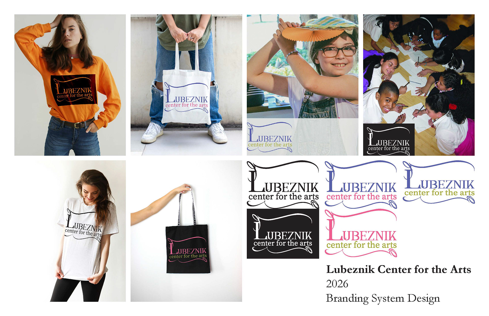
Description:
Formerly the John G. Blank Art Center in Michigan City, the Lubeznik
Center for the Arts houses rotating contemporary exhibitions, modern classrooms,
three gallery spaces, and a gallery shop. The organization supports exhibitions,
education, and community outreach that foster engagement with contemporary art
and ideas.
Center for the Arts houses rotating contemporary exhibitions, modern classrooms,
three gallery spaces, and a gallery shop. The organization supports exhibitions,
education, and community outreach that foster engagement with contemporary art
and ideas.
Challenge:
Propose a refreshed logotype direction that reflects the Lubeznik
Center’s role as a cultural destination and educational hub. This project
emphasizes logo direction, typographic exploration, and applied mockups.
Center’s role as a cultural destination and educational hub. This project
emphasizes logo direction, typographic exploration, and applied mockups.
Solution:
This logo concept utilizes Annabel 1 font. The curvy accented strokes imply elegant artistry which reflects Lubeznik’s role as a cultural destination. The variation in stroke weight within the letterforms in combination with the angular pointed serifs and ball terminals reflect sophistication and intellect which reinforces Lubeznik as an educational hub. This logo also implements Variable Source One font which provides various font familes so that various product applications can be done.
Description:
Constellation Stage + Screen is a professional nonprofit theatre
company in Bloomington, Indiana, formed through the merger of the Pigasus
Institute and Bloomington Playrights Project. The organizing is dedicated to
developing bold new work while producing innovative theatre and screen projects
that serve Bloomington and the surrounding region. Constellation Stage + Screen
emphasizes contemporary storytelling, artist development, and community
engagement across live performance and cinematic platforms
Challenge:
Propose a refreshed visual identity that reflects Constellation Stage +
Screen’s values values while positioning the organization as relevant, accessible,
and forward-looking. This project emphasizes logo direction, brand consistency,
and professional application.
Screen’s values values while positioning the organization as relevant, accessible,
and forward-looking. This project emphasizes logo direction, brand consistency,
and professional application.
Solution:
This logo direction is designed to communicate the time period in which Constellations Stage and Screen became a combined entity. This happened in the month of July which is the Cancer zodiac sign represented by the crab. I illustrated a simplified crab with the Cancer constellation to achieve a starry night celestial effect and celebrate the company’s transition into a singular theatrical producing entity. I altered the scale on two of the smaller stars to achieve visual diversity. The orientation of the crab arms are meant to evoke accessibility and approachability. I also cut out the larger star shape in the back of the crab to increase unity of forms and elevate the celestial effect of the overall appearance of the logo.
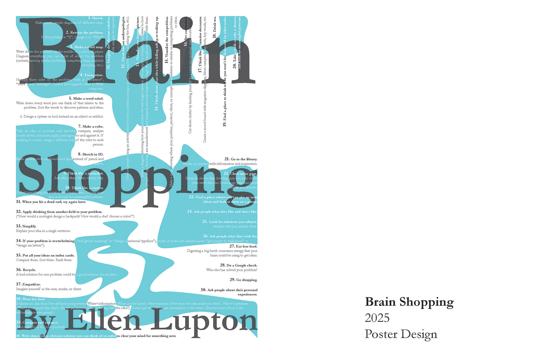
Description:
Ellen Lupton is the author of Graphic Design Thinking: Beyond Brainstorming in which she disscussed the concept of brain shopping that denotes methods for producing a variety of ideas.
Challenge:
Composite her list of methods and organize them into a design poster layout.
Solution:
I incorperted various alignments to transform the text into puzzle pieces of sorts within the composition to generate visual interest and used bold text and scale to communicate hierarchy of importance and allow for the viewer to navigate easily. I included blue organic forms to function as a tool to lead the eye and allow the opportunity to change the text color to escalate diversity and complexity. The title is set at a higher scale compared to the rest of the text to illustrate emphasis but also is at a lower opacity to facilitate overlap.
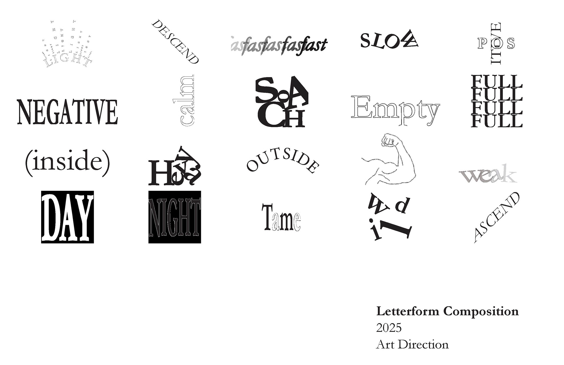
Description:
This project was a study intended to visually demonstrate the meaning of each respective word using letterforms only.
Challenge:
The parameters of this project were to minimally manipulate text and primarily operate using scale, various typefamilies, opacity, and alignment to convey each message.
Solution:
I altered between scale, alignment, typefamiles and repetition of letterforms to generate shapes that reinforced the conotation and definiton of each term respectively and composite a variety of compostions.
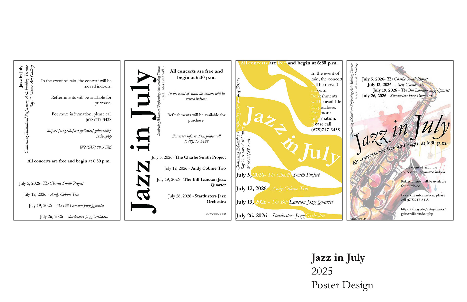
Description:
Jazz in July is a free musical event for North Gerogia University students at the Gainsville campus that prioritizes facilitating students with the opportunity to experience cultural music pieces pertaining to the Jazz genre.
Challenge:
Design a poster that communicates all relevant information for the Jazz in July event.
Solution:
I apprached this project through a series of iterations before generating the final work. The first iteration I prioritized alignment and type family varioations to achieve visual hierarchy. In the second iteration I incoperated scale as a tool to illustrated visual hierarchy. In the third iteration I introduced colored organic forms. In the final iteration I incorperated an image in combination with alignment, scale and type family manipulation to achieve a visually dynmaic and navigatable piece.
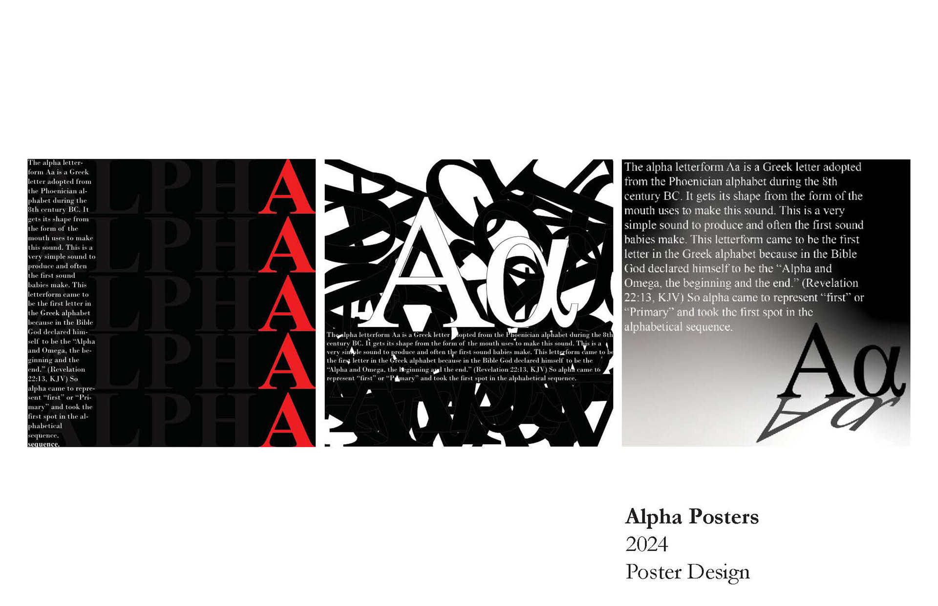
Description:
The purpose of this project was to research the orgins and history of the Greek letterform alpha and composite that information into a poster design.
Challenge:
The parameters of the task are to use minimal color, the letterform and the body text in the design.
Solution:
In the first iteration I used the term alpha to created a textured background set at a lower opacity and made the A letterform red to visually demonstrate emphasis. The body text is plce at the opposite end to facilitate balance. In the second iteration I layered the letterforms "A," and, "a" to create a textured gradation in the background. I then used the body text as a pedestal for the Letterforms Aa in white to create constrast and visual clarity. In the third iteration I used gradation to create a triangular shape that resembles surtains as if the letterforms are being revealed on stage and the text being larger to emphasize the information over the letterform.
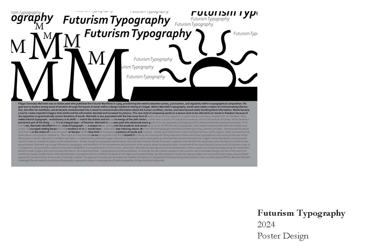
Description:
Futurism Typography has had a profound impact on the design comunity in terms of experimentation and variety of compostion.
Challenge:
Research Futurism Typography and develop a poster design that utilizes its respective style.
Solution:
Futurism Typography emphasizes the use of letterrforms to create shapes that refer to landscapes or objects to generate visual interest and reinforce the information presented. I used the letterform M to create mountains, O, and S to create a sun and the repition of Futurism Typography to illustrate clouds in the sky. The body text I included in the gray body to function as mountains overlooking the water and used bold in some areas of the text to function as shadow shapes.

Description:
The purpose of this project was to pick an object to vecotrize in illustrator.
Challenge:
The object had to be one composite shape.
Solution:
I sketched images of a glass and imported my file into illustrator and traced over the forms with the pen tool to create one vectorized shape.
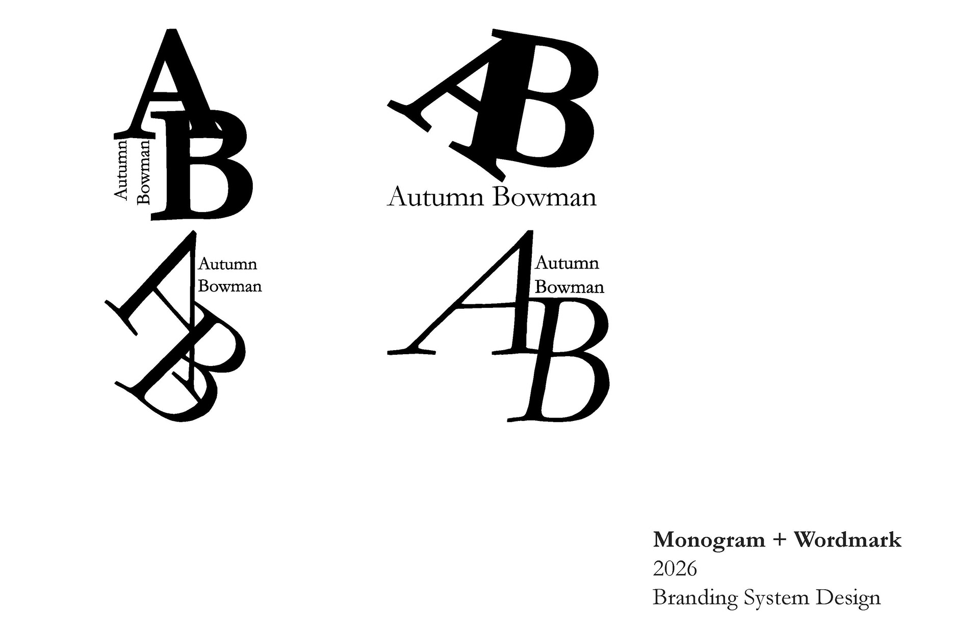
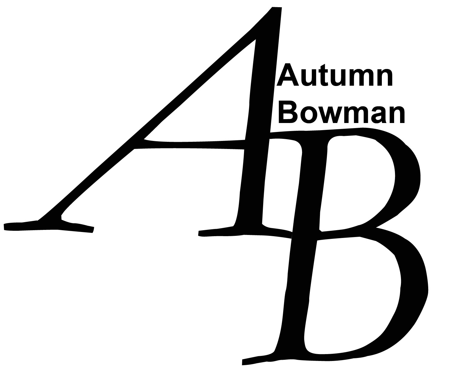
Description:
The purpose of this project was to generate a self brand identity.
Challenge:
The self brand identity was to consist of my initials and name to function as a wordmark.
Solution:
I rendered four iterations but liked the fourth on the best because of how the letterforms overlap in a infinite circle that I find visually pleasing and the top of the B creates a cliff to shelf my name so that the entire composition feels cohesive.
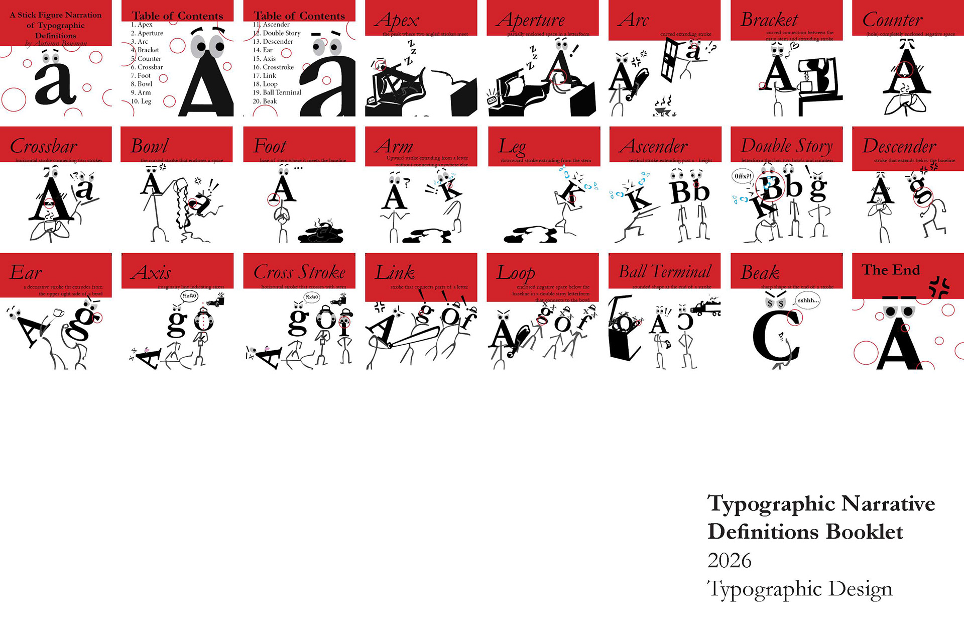
Description:
The purpose of this task was to develop a booklet that defined typographic terms in a visually pleasing way.
Challenge:
The parameters of this project was to only operate within the use of letterfoms, alignment, scale, color.
Solution:
I transforme the letterforms into stick figure characters to create a murder story that not only retains viewer interest but fulfills the purpose of teaching typographic term definitons via visual association. I include a red circle to help identitfy the respective aspects each term refered to, to promote visual clarity.
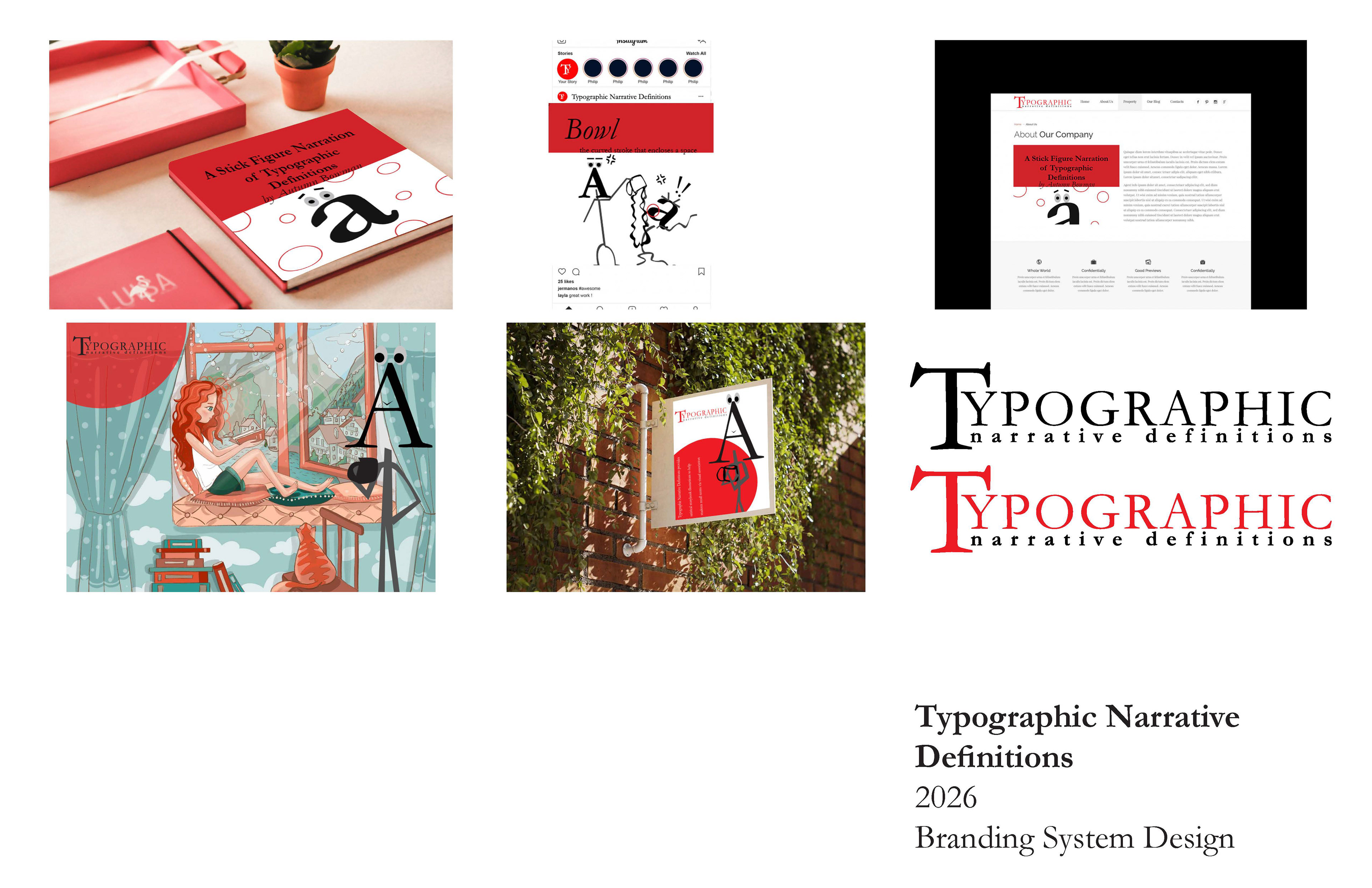
Description:
Revisit and redesign a previous project.
Challenge:
Re-evaluate the original concept, refine the visual direction, and
redesign the work with stronger typographic hierarchy, clarity, and cohesion with an emphasizes on iteration, refinement, and system thinking.
redesign the work with stronger typographic hierarchy, clarity, and cohesion with an emphasizes on iteration, refinement, and system thinking.
Solution:
The previous project I choose to expand on was my typographic narrative book, I designed a logo since it did not have one using Garamond typeface to maintain cohesion witht the rest of the book. I increased the scale of the T to function as a border tool and tol also lead the eye through the rest of the words. I adjusted the spacing between the Y and T collectively. I also made the basline underneath a smaller scale but still aligned to compensate for the adjusted spacing. To avoid loosing readability I also made the second baseline bold while having the top term be all capitals to clearly illustrate heirarchy. I then generated mockups to demonstrate how the brand could be applied to various applications.